50 years of BART: To learn the story of BART, look to its system maps
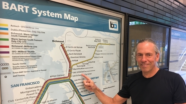
Bart Wright with a BART System Map hung in a station in 2019.
A map can tell a person where to go, where not to go, and how to get there. It orients the viewer in physical space – but also geographic time, chronicling the shifting landscape and the patterns of human motion.
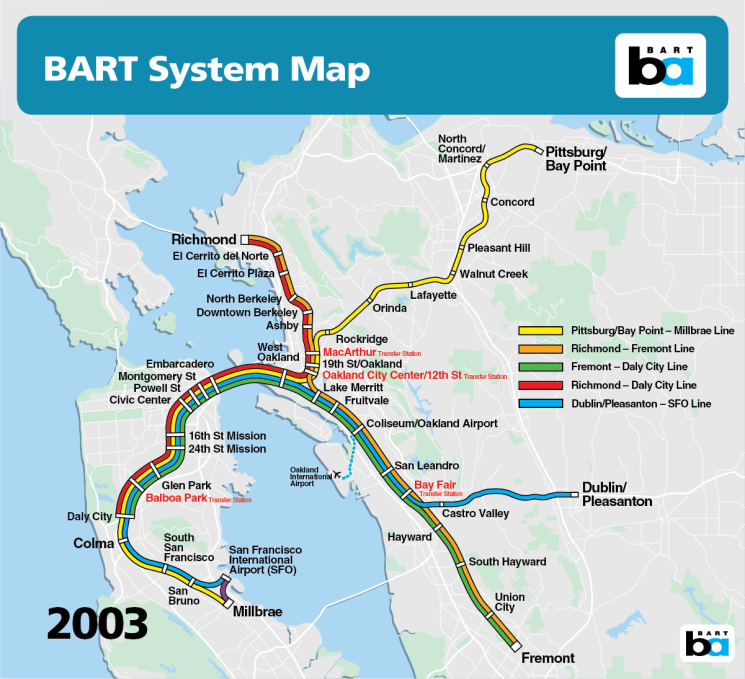
The BART System Map is one of the most iconic maps to grace the modern Bay Area. To locals – and even visitors – the map is instantly recognizable: large chunks of light blue pockmark a white background carefully drawn with colorful BART lines. It is, in many ways, a work of art that has come to define the Bay Area and its residents’ movement. (More fodder to this point: The Oakland Museum of California included BART maps in a 2021 exhibition of Bay Area maps).
The BART map has changed not insignificantly throughout the system’s five decades. The initial design painted the bay and Pacific Ocean in a dark blue, while the four lines pop in red, orange, yellow, and green. Later iterations documented the addition of new stations, crossings, geographic features, and transfers.
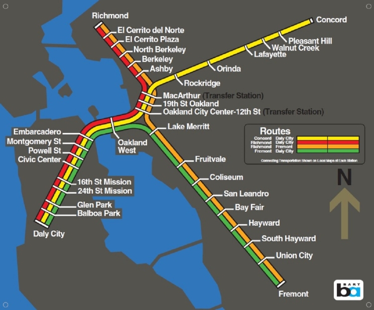
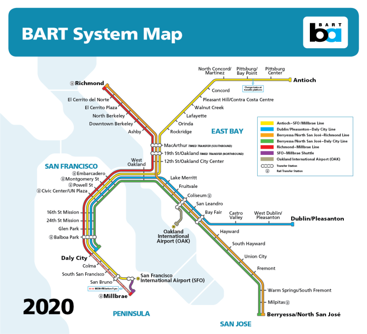
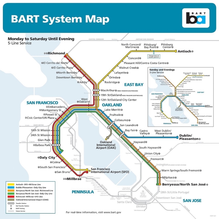
The current BART map is an enhancement from a design originating around 2010/2011. It not only shows the BART system, including the newly opened Berryessa/North San Jose Station, but also other connecting public transit systems, such as San Francisco Muni and the Santa Clara Valley Transportation Authority. The map (pictured below) shows 5-line service throughout the week, while the inlaid map shows evening 3-line service.
The map was designed by the aptly named Bart Wright, a Bay Area-based professional designer and mapping expert. Wright has been working on and iterating the map since the 1990s, when he worked for Bay Area-based firm Reineck & Reineck fresh out of college.
“It was one of the first projects where we really did everything on a computer,” said Wright of the 1990s-era BART map. Wright went on to cofound his own mapping firm, Lohnes & Wright, in Oakland.
About fifteen years ago, when Reineck & Reineck retired, Wright took up the BART map himself. He now works directly with BART to iterate upon the map, adding a station here or a transfer there.
“Every year, or every other year, there’s some sort of change required to the map,” Wright said.
Wright remembers well the first map that left a lasting impression. It hung in his grandfather’s living room, a three-by-four-foot raised relief map of the U.S. As a child, he used to stare at the lines along the map, tracing his fingers along the bumpy mountain ranges.
“I looked at it all the time,” Wright said.
Wright never considered mapmaking as a career or field of study, until a friend of his said, “You’re always looking at maps, why don’t you study it?”
“That was it,” he said. “I was hooked.”
He said he’s drawn to maps because of their ability to “take you away to different places” and to orient you in a space.
“Looking at maps, it’s easy to see all these worlds,” he said. “And everyone sees something different when they look at it.”
When you view the BART map, what do you notice? Are you following the line from your Point A to Point B? Are you seeking out your parents’ house? A former school? A park you spent much time lounging in?
“Some might see the map as a historical family thing,” Wright said. “Another person might look at it with a grumble, saying, ‘How many years did I commute into San Francisco? I’m glad I don’t have to do that again.’”
Maps contain different connotations and spark varied emotional responses and memories. And when you’re in the public transit industry, every map of the system must be easy-to-read and understandable above all else, so that riders can get safely and efficiently where they need to go.
“It’s got to convey the information quickly and easily,” Wright said. “If you’re standing on a crowded train, and you’re looking over someone’s shoulder trying to figure out where to transfer, you’ve got to be able to get that info. You want a clean and easy-to-read design.”
When designing the most recent iteration, Wright worked with BART to determine “a hierarchy of features.” The group determined what was most important to clearly depict: the stations first, then the lines, the transfers, airport connections, parking, and so on.
“It made the design very easy,” Wright said.
Wright’s favorite aspect of the map is how “the other transit connects with BART. It paints a geographical picture for you. It’s schematic. I love how that works,” he said.
The creators of the original BART map, with its dark blue water and single orange line, remain unknown. Wright thinks the designers likely belonged to one of the engineering firms involved in BART’s creation. He knows with altogether certainty that the mapmakers created that original design on silkscreen.
Though a seemingly innocuous object, you might be surprised that map design – even the color scheme – can be highly contentious. In one famous example, famed modernist subway designer Massimo Vignelli created a map that set New Yorkers aflame in 1972. On the map, Central Park, for one, was brown, and the waters surrounding New York City were beige. Riders didn’t like it; some even ripped it off station walls.
For Wright, the map must use a color scheme that’s easy to see and understand.
“You’re not going to make the bay red,” Wright said, as an example. This can prove a challenge, however: How do you distinguish one public transit map from another?
“Unfortunately, transit maps are all starting to look the same,” Wright said. “In China, from a distance, you’d think, that’s a BART map! But it’s actually Shanghai. They all seem to have big bold lines, everything at angles, and very clean backgrounds.”
The BART map is distinguishable by the inclusion of certain geographic features – a matter of profound importance for Wright.
“You have this geography that’s very clear in the Bay Area that everyone consciously or subconsciously thinks about while they’re riding BART,” Wright said. Though we may take it for granted, some maps “don’t convey where you are or what’s going on; it’s just lines of trains or buses.”
For Wright, maintaining certain geographic features matters because it simplifies navigation. Generally, people “place themselves where they are.”
A successful map does what the BART map does, Wright said. “It makes navigation easier.”
As for future BART maps, Wright thinks it might be soon time to “rethink the iconic map,” especially as BART extends to San Jose.
“When you build out the system to San Jose, maybe it’s a good time to say, this map has reached its overall life,” he said.


